When undertaking a large-scale redesign, it can be tricky for stakeholders to envision how the necessary information will be organized on a new website. This is particularly true if they’ve never been through the web development process before.
In my role as the project manager on a recent site redesign, I worked with our UX team and the client to define the content of the site. Without a visual template, stakeholders struggled to understand the new site’s layout.
It’s a bit like building a dream home. You may have an overall vision. Still it can be hard to imagine the most effective floor plan or if the furniture will fit.
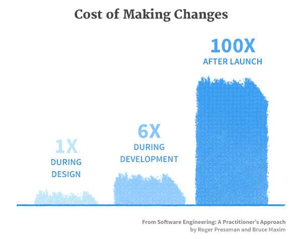
The most expensive time to make changes is after the home is built. The better option is to play with various layouts beforehand. As Frank Lloyd Wright is purported to have said, “You can use an eraser on the drafting table or a sledge hammer on the construction site.”

An important step
This is why we utilize an important step: wireframing. For us, wireframes are essential to successful web development projects. They are a stepping stone between site mapping (a flow chart of the site’s pages or a full-blown information architecture) and the graphic design mock ups. They provide stakeholders with a visual layout without the distraction of colors, images, fonts, and graphics.
To go back to our house analogy, wireframes work like house blueprints to provide a basic understanding of layout, design, and traffic flow. As the chart above suggests, they also provide the flexibility to address some of the constraints we encounter when working with public sector clients.
However, without the appropriate knowledge of what the wireframes represent, clients can find the lack of detail and graphic definition more confusing than helpful. We’ve found a little introductory work is essential to be most efficient.
Too often misunderstood
Immersed as we are in web solutions, we can be guilty of believing everyone has a working knowledge of wireframes. However, this isn’t the case. Particularly in government agencies, site redesigns can be rare occurrences. As well, almost all of the stakeholders have “day jobs” that don’t allow much time to learn web design techniques.
It’s not uncommon for the following issues to arise:
- A lack of understanding about what wireframes are and how they fit into the process
- Misunderstandings because wireframes are not an exact representation of the final product
- Disagreement about the terminology used in wireframes
Without a proper introduction, confusion ensues, and we might run into questions like:
- “Why don’t all of the links work?”
- “What language is lorem ipsum and what does it mean?”
- “Why is my new site only black and white, where are the colors?”
Stakeholders or SMEs who are less involved in the project may assume the wireframes are the actual site. This is especially common when we use rapid prototyping tools like Axure to generate clickable, interactive wireframes. Panic sets in when stakeholders believe the train has already left the station in terms of design and structure. At worst, they may think they’re stuck with a black and white site or that they’ve missed the opportunity to make contributions to the design process.
To this we say, “Don’t panic! Our design process is just beginning, and this is exactly when we want your feedback.”
How wireframes can save the day
Wireframes may look like meaningless gray boxes, but with a little context, they can provide a clear representation of the final product. They help manage the following issues, without sending the project off the rails:
- Prescribed solutions defined during the RFP process that may no longer fit the project
- The need for approval by committees or large stakeholder groups
- The need to deliver on a fixed budget and fixed timeline
Since wireframes are usually done early in web design process, they quickly clarify any limitations in current thinking by bumping against the pain points. Through review and testing they allow everyone to recognize the usability issues up front. Stakeholders can see that the site may not be able to perform in the way they had originally planned…the furniture just doesn’t quite fit in the room.
Proper wireframing can also:
- Point out flaws in assumptions made in requirements
- Identify the impact to the layout if more content is added
- Connect usability to content and context to reduce major changes later in the design and development processes and prevent wasted hours and budget overruns
Through iterative review, wireframes evolve to the best possible layout, navigation, and features. They also demonstrate how compatible those features are with the tablet and mobile experience. The image of the ideal site comes into focus as further adjustment are made.
Putting wireframes in context
As with other project tasks, communication is essential for outlining what to expect when delivering a grayscale wireframe version of the site. Before undertaking the wireframe process, we take the time to define to stakeholders the objective of this step. And, as wireframes are typically one of the first deliverables in a redesign, they allow us to establish a standard for the feedback process throughout the project.
The following tweaks have helped us change the wireframe step from one of confusion to time savings:
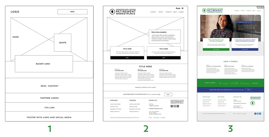
1. Provide examples: Illustrations of the design workflow, such as a sequence of how wireframes turn into designs and finished websites on other projects, can clarify the preliminary role of wireframes in the entire design process. It can also be useful to offer suggestions of how to navigate the wireframes as a persona with specific needs.

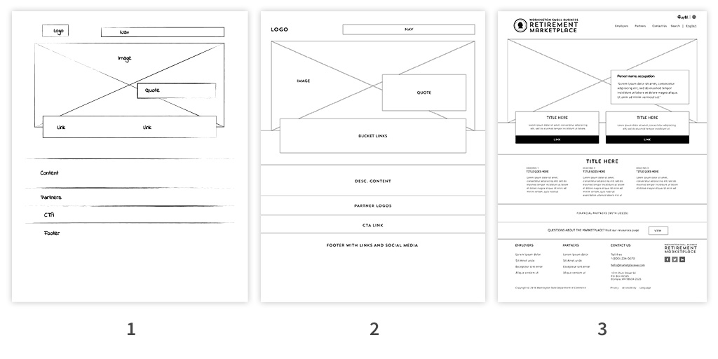
2. Start with sketches: Start with more abstract versions of wireframes. Pencil and paper or whiteboard drawings and sketches can help reduce the client’s anxieties that the design train has left the station. Sketches emphasize the fluid nature of the process. Once the client has the chance to offer input, sketches can be transferred into wireframe tools like Axure.

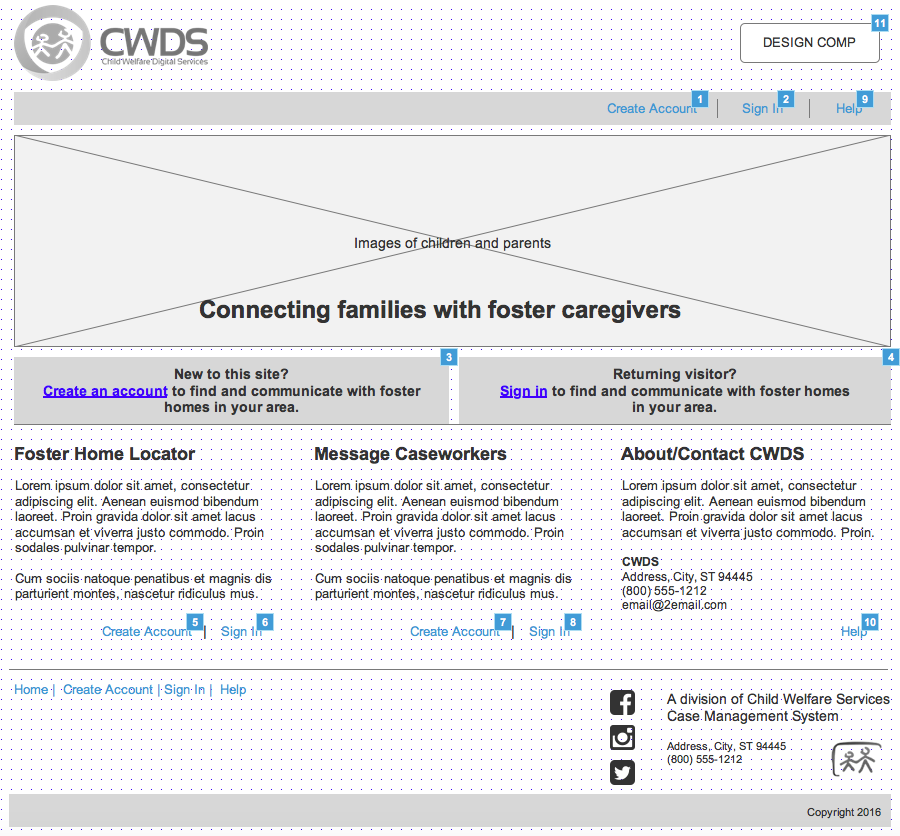
3. Clarify naming conventions: If possible, we fully vet the final naming conventions and labeling before presenting wireframes. Otherwise, we utilize identifiers, like “header” or “call to action” or “link text.” We also try to include annotations of intent with the comments tool in Axure to more clearly communicate the envisioned use of certain features. This helps clients let go of labeling/naming details and focus on the function.
As a funny aside, we’ve even encountered some confusion around the use of “Lorem Ipsum” dummy text. The client thought the greeking text was a foreign language. To prevent lost time in explanations, it’s a good idea to define up front that Lorem Ipsum text is just a placeholder. Google Translate will not provide any help here!

Communication is key
Proper communication about wireframes can help overcome common hurdles to the web design process. The three tips defined here build greater understanding with stakeholders:
- Examples and background about the purpose of wireframes
- Starting with informal sketches
- Clarifying the placeholder nature of text and titles
Clarity around the purpose of wireframes saves time for us, and money for the client, by preventing lengthy misunderstandings and changes. Ultimately, these precautions allow for more fruitful discussions during the entire design process, while still keeping the project on track.
About to embark on a site or application redesign? Ask your contractor to clarify these issues before you get too deep into the process. If you’d like more information from GovWebworks on how wireframes can save time and money, contact us.
Author bio
Over the past decade, Hellen Fitzpatrick has managed projects in the public sector for judicial, financial, and IT agencies. At GovWebworks, she looks forward to introducing new clients to the benefits of wireframing.


