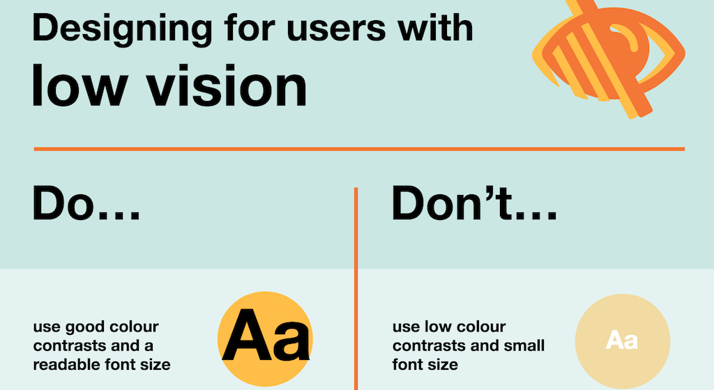
Image credit: Karwai Pun and Gov.uk from “Dos and Don’ts on Designing for Accessibility”
Accessibility is a big topic for public sector websites. Not only can the requirements of an accessible website seem overwhelming and difficult to grasp, but a 2017 study by Gov.uk indicates that automated testing tools do not easily provide a guarantee of the accessibility of a website.
This may come as a shock for many government agencies that rely on automated testing to assure 508 compliancy. With this in mind we’ve compiled a list of the primary areas that are important to manually review to be sure a website is compliant.
If you want to understand accessibility and testing better first, read on, if not, skip to the “Top 5 issues to review for accessibility” below.
Why accessibility matters
“Imagine: You can’t see at all. You use a computer with a screen reader. A mouse is mostly useless to you. You use your keyboard to navigate around interfaces and sites.”
While this is a scenario posed by Adam Morse in The Veil of Ignorance, some or all is reality for the 8.1 million people in the U.S. living with a visual disability.
A 2010 report from the U.S. Census Bureau found that 18.7% of the U.S. population has a disability of some kind. That’s about 56.7 million people. Of this number:
- 8.1 million have a visual disability – they might rely on a screen magnifier or a screen reader, or have a form of color blindness
- 19.9 million have difficulty lifting or grasping – this impacts the use of a mouse or keyboard
- 7.6 million have a hearing disability – they might rely on transcripts and/or captions for audio and video media
Enter Section 508
Established in September 2010, the Americans with Disabilities Act (ADA) Standards for Accessible Design supports equal access to information for people with the following disabilities:
- low or limited vision
- limited physical or motor skills
- low or limited hearing
- dyslexia
- autism
- reading difficulties requiring use of a screen reader
Under the ADA, Section 508 regulates accessibility standards for information technology, including computer hardware, software and documentation. The Web Content Accessibility Guidelines (WCAG) 2.0 from W3 cover a wide range of recommendations for making web content more accessible.
Although WebAim has created a useful WCAG 2.0 Checklist, the challenge comes when trying to make sense of all the requirements. It helps to understand that many of them pertain to making a website accessible to screen readers. Audio interfaces, such as JAWS or ChromeVox, convert digital text into synthesized speech. Because they read content linearly, the web page must be presented in such a way that a screen reader can make sense of it.
This means images must be described in the alt tags and color can not be used as the sole method of conveying content. Furthermore, since keyboard shortcuts like the tab key are used to navigate content with a screen reader, the page must include correct tags for heading levels and other page layout elements.
Why automated testing isn’t enough
While there are a number of automated testing tools, according to a study by Gov.uk, “No tool will be able to pick up every accessibility barrier on a website. And even if they do detect a barrier, sometimes the results they give will be inconclusive or require further investigation.”
In the study, some of the issues the automated tools missed included:
- images without alt attributes
- the wrong alt attributes
- blank link text
- flashing content that didn’t carry a warning
- plain language not used in content
This is why they recommend combining automated testing with standard manual quality assurance and user testing.
“A good analogy is to think of a testing tool as like using a spellchecker,” says Gov.uk. “It can certainly help you pick up issues, but it should never be used in isolation. To be most useful, automated tools should be combined with manual inspection and user research.”
Top 5 issues to review for accessibility
With some help from the useful posters in Gov.uk’s Dos and don’ts on designing for accessibility, we compiled the following list of the top five issues to review when verifying website accessibility.
1) Image clarity
- alt tags to define purpose and content of images
- image maps to define links on images
- HTML text that replicates text in an instructional image or infographic
- simple rather than contrasting colors for image text
2) Language clarity
- plain language
- simple content format with headings and bullet lists
- text magnification to 200%
- hypertext links that make sense out of context, links defined by underline not just color
- HTML5
3) Table, graph, chart, and frameset clarity
- charts and graphs described in alt tags
- content in frames described in text or a non frameset version of the page
- table content summarized in HTML text and content that makes sense when read out of table form
4) Audio and video assistance
- captions and subtitles for video and audio
- HTML transcripts of audio and video
5) Keyboard controls
- clickable actions for keyboard shortcuts instead of a mouse
How we can help
Because of these complications, web accessibility and compliancy testing is often maintained by an outside vendor. We’ve recently worked with Washington DSHS, Vermont Judiciary, and Missouri Department of Conservation to establish and define their compliance and testing.
Let us know if we can help with your accessibility questions or concerns.
Learn more
- Gov.uk’s Dos and don’ts on designing for accessibility with posters
- Gov.uk’s What we found when we tested tools on the world’s least-accessible webpage
- Adam Morse’s The Veil of Ignorance
- Digital.gov’s Benefits of Accessible Design
- Design Mantic’s Web Accessibility 101 infographic


