User-centered design (UCD) is an ongoing conversation in the public sector, and at GovWebworks. In our last post, UX Playbook Part 1: How we identify project goals and user needs with heuristics, interviews, and surveys, we introduced the UCD approach taken in Minnesota to revamp an employment services platform. We detailed basic data gathering techniques, such as stakeholder interviews and surveys, that were used to learn more about Minnesotans’ employment habits.
With the data from the interviews and surveys, we defined our personas. These personas informed the types of questions and concerns that made up the card sorting labels. We then identified user groups based on the personas, and recruited them to take part in open card sort and tree test studies.
In this post, we’re going to break down our approach to clarifying the information architecture (IA), or site structure and navigation, with card sorting and tree testing techniques.
First, we used card sorting to define the terminology and content groupings for the information architecture. Then, we did tree testing to finalize the information architecture in preparation for UX Playbook Part 3: How we develop wireframes and design prototypes with Sketch and InVision.
Card sort study
What is card sorting?
Card sorting helps us understand how our users think, and how they categorize information. This is particularly important when defining a new platform, or one that has no previous data. In a card sort study, participants are provided a pile of cards with labels on them. They represent areas of content or concepts that need to be organized. In an open card sort, we ask participants to organize cards into groups that make sense to them and then label those groups. We ran the card sort remotely through the OptimalSort tool from Optimal Workshop, asking 69 participants to organize 30 labeled cards into categories and give them names.
OptimalWorkshop’s data visualization outputs enabled us to get a rounded perspective on the results. Below are a few visualization formats that helped inform the suggested IA.
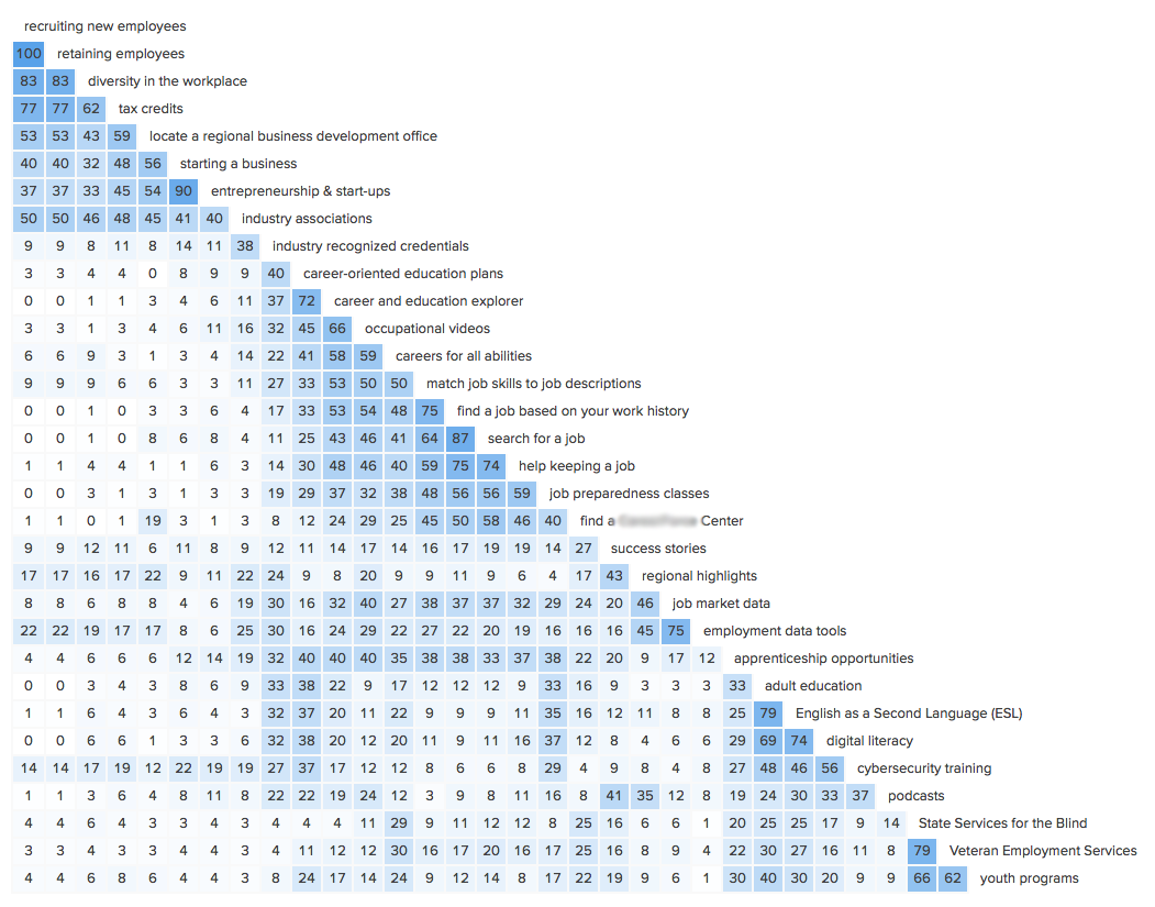
Similarity matrix
This visualization shows the percentage of participants who agreed with each card pairing. Dark blue areas show strong agreement as to which cards are similar to another.
Takeaway: We were able to see how generally scattered the results are, which shows how disparate the information is as a whole. We recommended renaming cards or moving content from scattered cards to increase agreement.
Participant-centric analysis
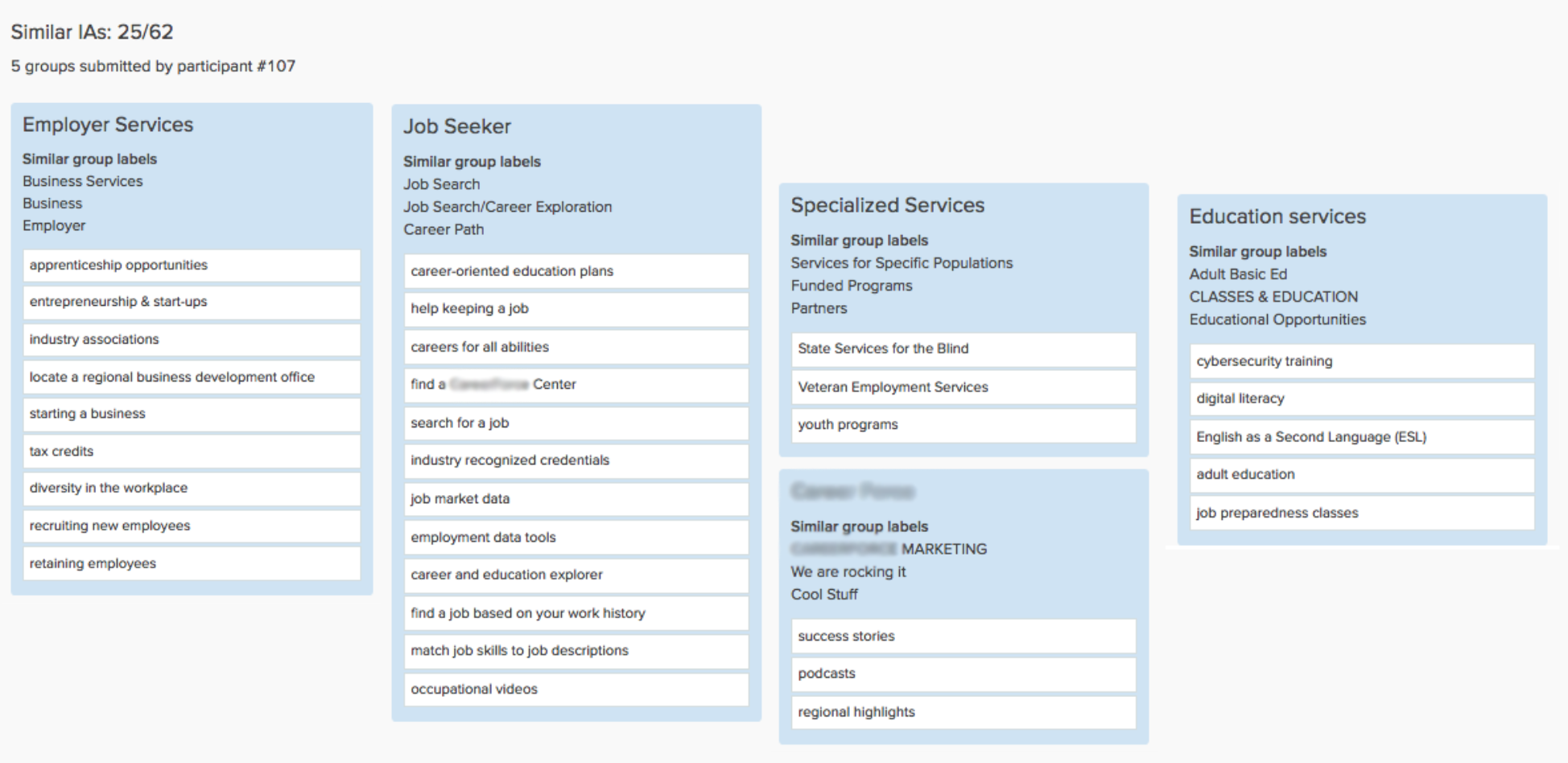
This view presents the most common preferred groupings by study participants, based on the similarity to other responses. Of the 62 participants, 25 (more than a third), chose an information architecture made up of the following five groups.
Takeaway: Since these suggested groupings had the highest approval rating, we recommended using them for the navigation in the information architecture.
Further card sort learnings
- We received several comments from sorters asking for the ability to put cards into multiple categories. This suggested that current category labels seemed similar to testers. We noted the study could be biased by the constraints of the card sort software, which limited users to associate cards with a single category.
- We also heard that current labels weren’t providing enough context about the content the label represented. This, along with the low level of agreement represented in the similarity matrix visualization, told us that we needed to rename the labels. We also might need to reconsider a conversational way of introducing navigation to users or organizing and introducing the navigation within the content.
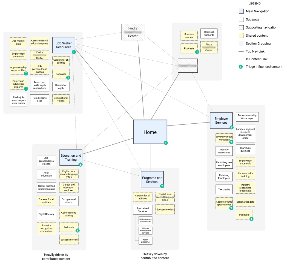
Information architecture
The following information architecture is based on the above input and adjustments:
Tree test study
What is tree testing?
Per the Optimal Workshop explanation, tree tests show how easily people can find topics in the proposed information architecture, and where they get lost. Because users rely heavily on a site’s navigational structure to learn more about the product, it’s important to organize information in a way that is easy to trace.
Tree testing can answer questions like:
- Do labels make sense to people?
- Is the content in logical groupings?
- Can people easily and quickly find the information they want? If not, what’s stopping them?
Participants were asked to complete a series of tasks involving the proposed site architecture. They are presented with a simple tree version of the navigation and asked to indicate where they would expect to find content. We can see where users might get confused or turn around on the path.
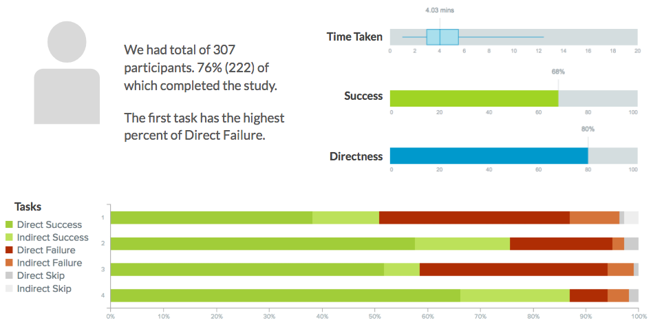
Using Optimal Workshop’s TreeJack product, we asked 222 remote participants to complete four tasks to evaluate the performance of the proposed information architecture. The below visualizations illustrate the pain points and provide guidance as to where labeling or organization needs to be improved.
TreeJack results
The results from participants were organized by TreeJack into the following categories, which help us to see how successful and direct the paths taken by participants were.
- Direct Success: when participants went directly to the correct answer
- Indirect Success: when participants ended up at the correct answer after backing up through the tree
- Direct Failure: when participants went directly to the incorrect answer
- Indirect Failure: when participants ended up at the incorrect answer after backing up through the tree
Pietree visualizations
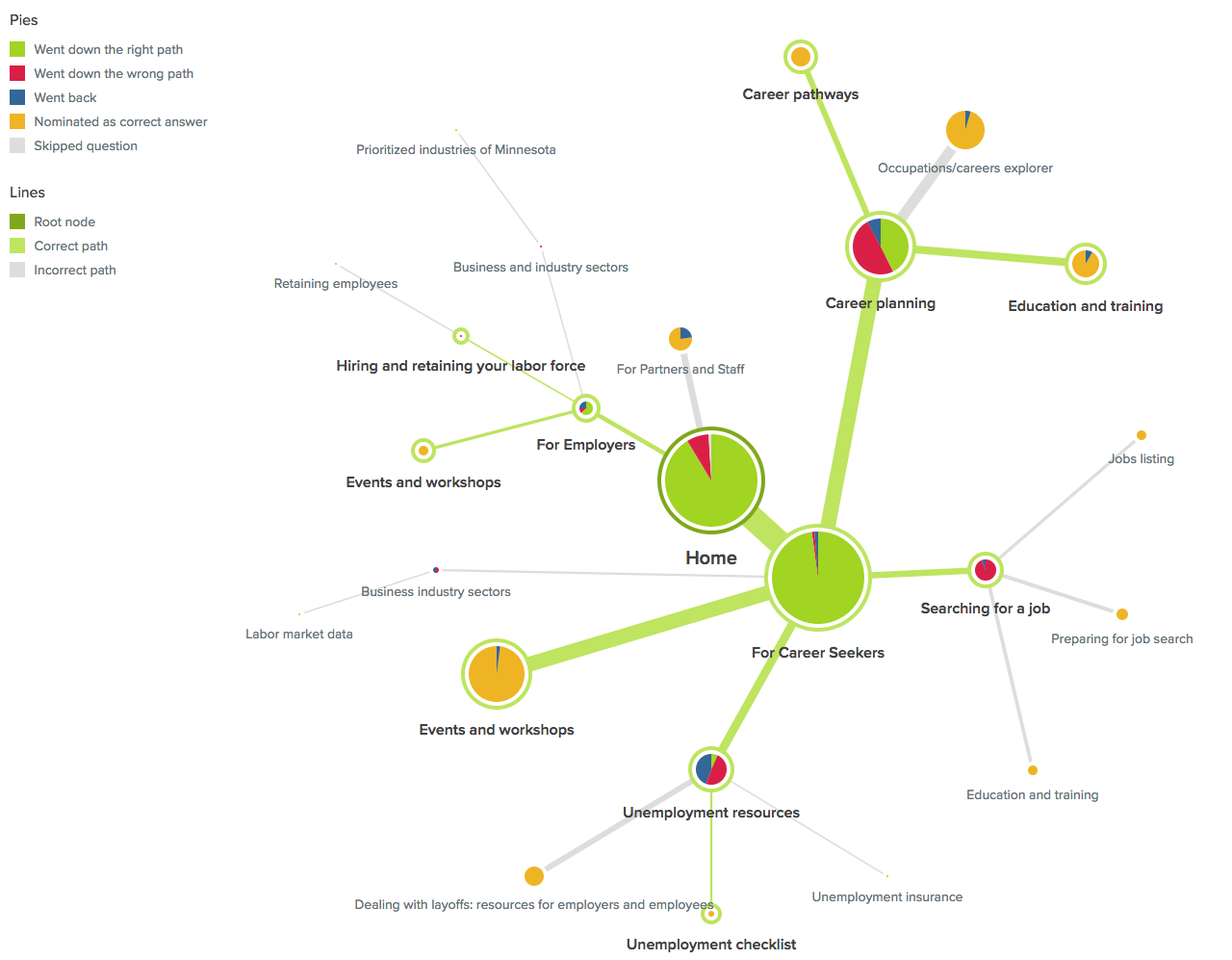
TreeJack’s Pietree visualizations show the junctions that participants pass in the information architecture before they find the correct answer. Ideally, this helps us to see if the content was easy or hard to find.
- Green pies are correct paths
- Yellow pies are the elected answers
- Red pies are the incorrect paths
- Blue pies are where participants backtracked up the tree to another location
Task 1
“You’ve heard about a service that does on-the-job training, where would you go to try and find this service?”
Takeaways from Pietree: This task had the highest percent of direct failure.
- The “For Me” conversational naming convention approach did not seem to be working, so we might consider removing instances of “For” in headings in favor of simple and specific terminology. (This coincides with the earlier usability goal of plain language to support users with lower literacy because in order to understand a conversational dialogue you need to have a higher level of language proficiency.)
- Likewise, the “Partners and Staff” terminology confused some testers. Either rename or remove Partners and Staff from the main navigation to avoid confusion.
Task 2
“You’re interested in hiring a person with disabilities, but you want some assistance on types of accommodations that could be made. Where would you go to learn more about hiring persons with disabilities?”
Takeaway from Pietree: “Overcoming Barriers” wording didn’t resonate as well as “Diversity in the Workplace.” This told us we should rename “Overcoming Barriers” or move content to “Diversity in the Workplace.”
Task 3
“You are currently unemployed and are receiving unemployment benefits. You are looking at changing careers, and are interested in taking a workshop on career planning. Where would you go to see if there is a workshop in your area?”
Takeaway from Pietree: Many looked under “Occupations/careers explorer” to locate workshops. Therefore, we might consider moving workshops under “Occupations/careers explorer” to align with user expectations.
Task 4
“You’re interested in moving to Minnesota from Ohio. You’re looking to find out if the job offer you just got is reasonable for the St. Paul area. Where would you go to find out about job market data for your industry?”
Takeaway from Pietree: People looked for move to Minnesota content under Career Seekers. Thus we should consider moving it to the Career Seekers content, or rename it to better reflect the intended use.
Further tree testing recommendations
- Repeating items across the navigation seemed to confuse users, therefore we should consider embedding additional instances of links into content instead of top navigation.
- Consider making the navigation more “horizontal” by adding more top-level options to reduce the level of secondary and tertiary navigational items. This would reduce the number of clicks and instances of backtracking.
Tree testing caveat
Finally, it’s important to note that tree testing provides a stripped-down view of the navigation, which means the users aren’t seeing the full picture. According to Nielsen Norman Group, the addition of design elements along with contextual cues can bring a 67% success rate up to 90% on the final design.
In summary
As mentioned before, user-centered design is a step-by-step process. We hope you enjoyed learning how card sorting and tree testing helps to refine site navigation. Next up is:
This is possibly the most exciting part of the process, because we see our work come to fruition in these blueprints for the future website.
Author bio
Amy Mauriello is a User Experience Strategist with 11 years of design experience in the fields of medicine, finance, education, SasS, and government. She has completed graduate courses in Human Computer Interaction and is an enthusiastic promoter of UX. You can take her User Research Techniques and Basics class on Skillshare.
Learn more
- Minnesota at the Forefront of Workforce Innovation: Working intensively across Minnesota to support grant-funded development
- UX Chat: Amy Mauriello and Karin Carlson – Applying usability standards to a government benefits enrollment process
- User Research Techniques and Basics – UX Class by Amy Mauriello on Skillshare


