Welcome to the third and final chapter of the UX Playbook series. Our process, thus far, has guided how we organized the content and information architecture for a public sector website in Minnesota. In this article, we’ll look at how we use this information to create wireframes and design prototypes.
User-centered design (UCD) is all about understanding the motivations and needs of the people we’re designing for, and validating the findings with the user base. As Natasha Noltimier of Evernote says on Dribble, “UX design is a constant exercise in empathy and understanding… I’m always trying to put myself in our user’s shoes to get at what they’re thinking and feeling at important moments during their experience with our product.”
A step-by-step process
So here’s where we’ve been, and where we’re going. In UX Playbook Part 1: Identify project goals and user needs with heuristics, interviews, and surveys, we gathered data from users and defined our user personas. These personas then informed the types of questions and concerns that made up the card sorting labels.
Next, in UX Playbook Part 2: Organize content and define site structure with card sorting and tree testing, we identified user groups based on the personas, and recruited them to take part in open card sort and tree test studies.
The card sorting results informed the creation of the information architecture (map of the site). And the tree testing refined it by helping us to adjust confusing terminology, and remove extraneous or repetitious elements.
Now, in Part 3, we’ll use the vetted information architecture to guide website functionality for the wireframes. The wireframes in turn provide a blueprint for the design prototypes that define the look of website.
Wireframes with Sketch
Wireframes are used to illustrate user journeys. They also ensure we are meeting user needs by laying out the interface elements that will appear on key pages. “The aim of a wireframe is to provide a visual understanding of a page early in a project to get stakeholder and project team approval before the creative phase gets underway,” says Experience UX.
Wireframing saves time because they’re much quicker to create than finished prototypes, and they force those reviewing them to focus on the underlying issues instead of getting caught up on visual design decisions such as color or font style.
Using the findings we shared in Part 2 as a compass, we were able to bring the desired user experience to life in the wireframes created with Sketch. Sketch is different from Photoshop and Illustrator because it is not solely image or vector based. Instead it’s based on the HTML box model and is able to export CSS code that is reusable for developers.
The following is a wireframe of the Career Seekers page created with Sketch (this is not the final layout):
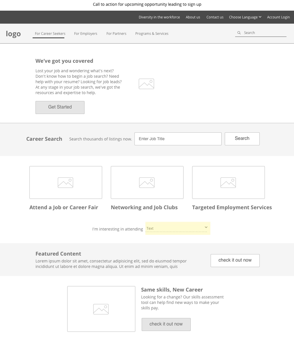
Project stakeholders and subject matter experts reviewed and vetted these wireframes. We then iterated upon the design until they met the objectives requested by users. Ideally this process would have included additional end-user testing, but the timeline limited our ability to do this. Furthermore, we felt the feedback from SMEs, along with the heuristic analysis, was enough to reach our goals for the project.
We then shared the wireframes with the development team and made some small changes based on technical feasibility constraints. After several revisions of the wireframes, we collaborated with our visual design team to put together the high fidelity prototypes.
Design prototypes with InVision
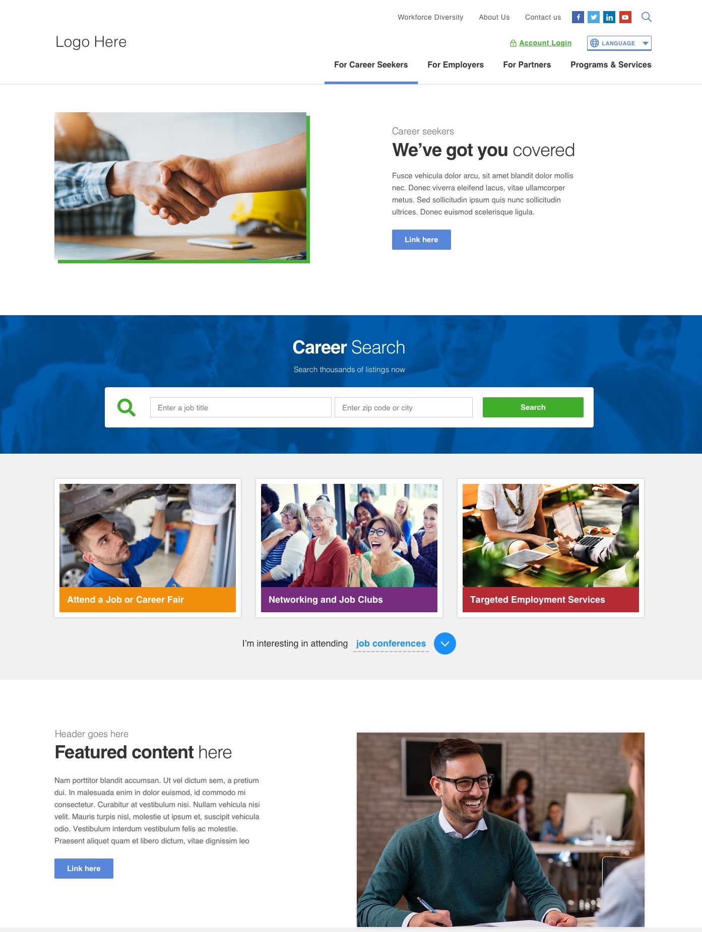
Design prototypes are visual mockups that show how the website will look and function. This stage is where it all comes together, the gray-tone wireframes come to life in color.
“A website prototype can be any mock-up or demo of what a website will look like when it goes live. It can be anything from a paper sketch to a clickable HTML prototype,” says Experience UX.
In the case of this project, the prototypes were mockups that helped ensure the site met brand guidelines while retaining key usability-informed design decisions. Peter Clark, the graphic designer on the project, took the lead at this point. He consulted the wireframes to determine the best way to merge them with the visual brand identity of the agency, that had been developed in parallel with a separate design vendor. They provided photography guidance and a developed limited color palette of blue and green, with accent colors for highlighted areas.
Peter used Sketch to develop multiple design iterations based on the wireframes and brand identity. These were vetted internally by the design team. The two best options were presented to the stakeholders via InVision, a tool that allows stakeholders to view and comment on the static designs. InVision also allows for clickable interaction between screens. We provided examples of the homepage and navigation, as well as the essential interior pages and clickable examples of functionality. The designs were vetted, creative feedback provided, and adjustments made.
The following prototype shows the progression from the initial layout concept of the wireframe, above, to a full-color design (this is not the final design concept):
Putting it all together
Not all of the initial research findings made it into the final designs, which is not uncommon. This project had specific constraints that impacted design decisions. Firstly, the platform is based on a content management system, which means users are able to make changes to the menu and create new content as they please, so the design had to provide this flexibility.
Additionally, we received input that the language and terminology should match plain language standards and the ongoing brand strategy. The design vendor also conducted independent research on the brand identity and strategy, which was included in the final design work.
Once the designs were finalized, Peter translated the visual decisions into a style guide for the development team. A style guide provides specific instructions for the technical development of visual details. These details include typeface, headings, and content, as well as color palette, logo usage, icons, button styles, and other UI elements. Furthermore, Peter provided mockups for the expected behaviors on mobile devices based on a Bootstrap grid system. These final steps assured that the website would be responsive and mobile friendly, as well as user centered.
In summary
Thank you for joining us on this journey. We hope you will revisit the previous segments of this series to see how we got here:
- UX Playbook Part 1: Identify project goals and user needs with heuristics, interviews, and surveys
- UX Playbook Part 2: Organize content and define site structure with card sorting and tree testing
Stated in Part 1, one of the benefits of UCD is that it helps to measure twice and cut once. Consequently, the end product is fully vetted, which often saves changes down the road.
As quoted before, Boehm & Basili say that “Fixing a software problem after delivery is often 100x more expensive than during requirements and design stage.” Therefore, a user-centered design approach is pivotal to reducing overall project cost and creating a desirable end product that your customers find useful and intuitive.
If you found this useful, I invite you to join me on my online course about User Research Techniques and Basics available through Skillshare. In this course I go into depth about many of the topics discussed here. By the end of the class, you’ll understand how to engage with your users. You’ll also learn how to gather data about them, and translate that data into actionable steps.
Author bio
Amy Mauriello is a User Experience Strategist with 11 years of design experience in the fields of medicine, finance, education, SasS, and government. She has completed graduate courses in Human-Computer Interaction and is an enthusiastic promoter of UX. You can take her User Research Techniques and Basics class on Skillshare.
Learn more
- GovWebworks: Wireframes are More than Greeking Text and Gray Boxes
- InVision: What is user research?
- Sketch: An in-depth look at Prototyping in Sketch
- Experience UX: Jared Spool talks to us about intuitive design and storytelling
