The mission of most public sector websites is to connect end users with meaningful results and information. Some portals provide answers to common questions. Others go deeper, connecting users with services and agency experts.
Yet, according CFI Group’s 2019 Government Websites report, public sector sites did not increase in usability from 2017-2018. As laid out in the President’s Management Agenda, connecting users to information and services is a priority of the Federal government’s modernization efforts. These goals include IT modernization, data accountability and transparency, and improving customer experience.
In thinking about how the public sector might begin to move the usability needle, there are a number of areas where traction can be found in helping connect users with content, data, and services. For this article, I’ve focused on some tools and techniques that I believe hold particular promise:
- Resource portals – provide a wide range of available services in one convenient place
- Smart chat agents – speed up ability to find content and provide answers
- Data visualization – make data easier to understand and improve transparency
1. Resource portals
Although technically still just a website, think of a citizen resource portals as cutting across traditional departmental and even public/private boundaries. Users shouldn’t need to understand the way different services fall in to different government departments and navigate between them. What if agencies collaborate to provide the information equivalent of shopping on Amazon; everything in one place, with easy access and speedy delivery? Obviously this requires a level of cooperation across departments, but the technology to support it already exists. To help customers find what they want quickly and easily, a portal should incorporate these three things:
- Ease of navigation – determined by user-centered design practices and user testing prior to site development
- Content filters and robust search – tagging content to make it easier to find
- Visually appealing interface – an inviting look and feel that makes users feel at home
The agency’s own website might still provide the heavy lifting for deep inquiries, but it seems natural that state and local governments would want to provide access to services and data in one place. A portal provides users with faster results, and minimal friction between their enquiry and the information they seek. For example, the Live Better Idaho resource portal houses information from multiple departments on one landing page.
2. Smart chat agents
AI is already being used to connect people to content more efficiently. Our phones, our cars and even our appliances are incorporating this technology to change the way we interact with information. The terms “Hey Siri”, “Hey Google”, and “Alexa…” have become the precursor to many of the questions we ask. Answers to the routine questions asked of government can equally be delivered via a smart chat agent, either via voice or on-screen. Consequently, content packaging must change to fit this need and to keep up with customer expectations.
According to Adam Kempler, in his blog on Smart Content Connectors, “Traditionally designed websites, devoid of smart content connectors, will become points of friction for citizens and fail to meet current expectations for content discovery and delivery.”
Agencies need to seriously consider how to integrate smart content connectors into their sites, especially now that voice connected devices and chatbots have become easier to incorporate. I am hopeful that more agencies will take the plunge and experiment with their own integrations.
3. Data visualization
Agencies may wonder why they should exert additional effort to artfully display data using graphs, charts, and tables. Technically they already meet the mandate of sharing data publicly via downloadable PDF or Excel files.
However, with the proliferation of data it can be hard to see the wood for the trees. Merely publicizing the data misses the opportunity to leverage data to transform society as advocated by the president’s management agenda.
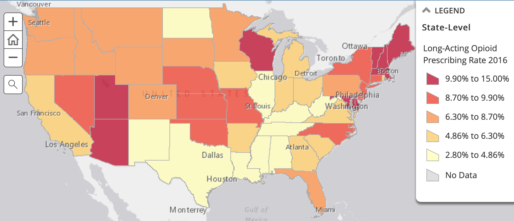
Tables of numbers can be meaningless to many people and it is easy for them to become frustrated if they don’t understand what the mass of data means. By presenting data in an understandable way, agencies gain trust and support for their core mission. The Center for Medicaid Services provides a good example of effective data visualization by mapping out opioid prescriptions by state.

Ideally, all aspects of data extraction and aggregation would be presented with graphics or maps that are easy to understand. Done well, these integrations can make information meaningful at-a-glance. The takeaway here is that people will feel more connected to things they can easily understand.
Summary
As agencies modernize their sites with new, intuitive, customer-focused portals, I expect that the following upgrades will become mainstream:
- Websites will evolve into user-friendly resource portals, providing everything in one convenient place
- Smart chat agents will connect people to content more efficiently
- Data visualization will make large amounts of data easier to understand
This is an exciting time for public sector engagement. Ultimately, people want easier access to services, according to the American Customer Satisfaction Index. While this means sites must become more complex behind the scenes, they will be easier to use and more customer-centric on the surface.
The prospect of a complete site overhaul may seem overwhelming. I recommend that agencies begin with small steps. Perhaps just one improvement or integration at a time. Incremental progress still adds value.
Sometimes the work can done in-house (as I wrote about in a previous blog on web modernization). However, if you lack the internal resources, or you just need some advice, we are here to help. I encourage agencies to take the three steps discussed here to make digital connections easier.
Learn more
- Contact us with questions about how GovWebworks can help with website modernization
- Check out the GovWebworks list of potential website enhancements
- Delivering Modern Digital Services to the Citizen With Transparency and Measurement, GovLoop
Author bio
Ravi Jackson has a background in law, finance, and policy, with 10 years of experience in the Maine state government. A witty Brit with a gift for discourse, he welcomes further discussion on this topic. He can be reached at ravi.jackson@govwebworks.com and @RaviJacksonGWW on Twitter.


