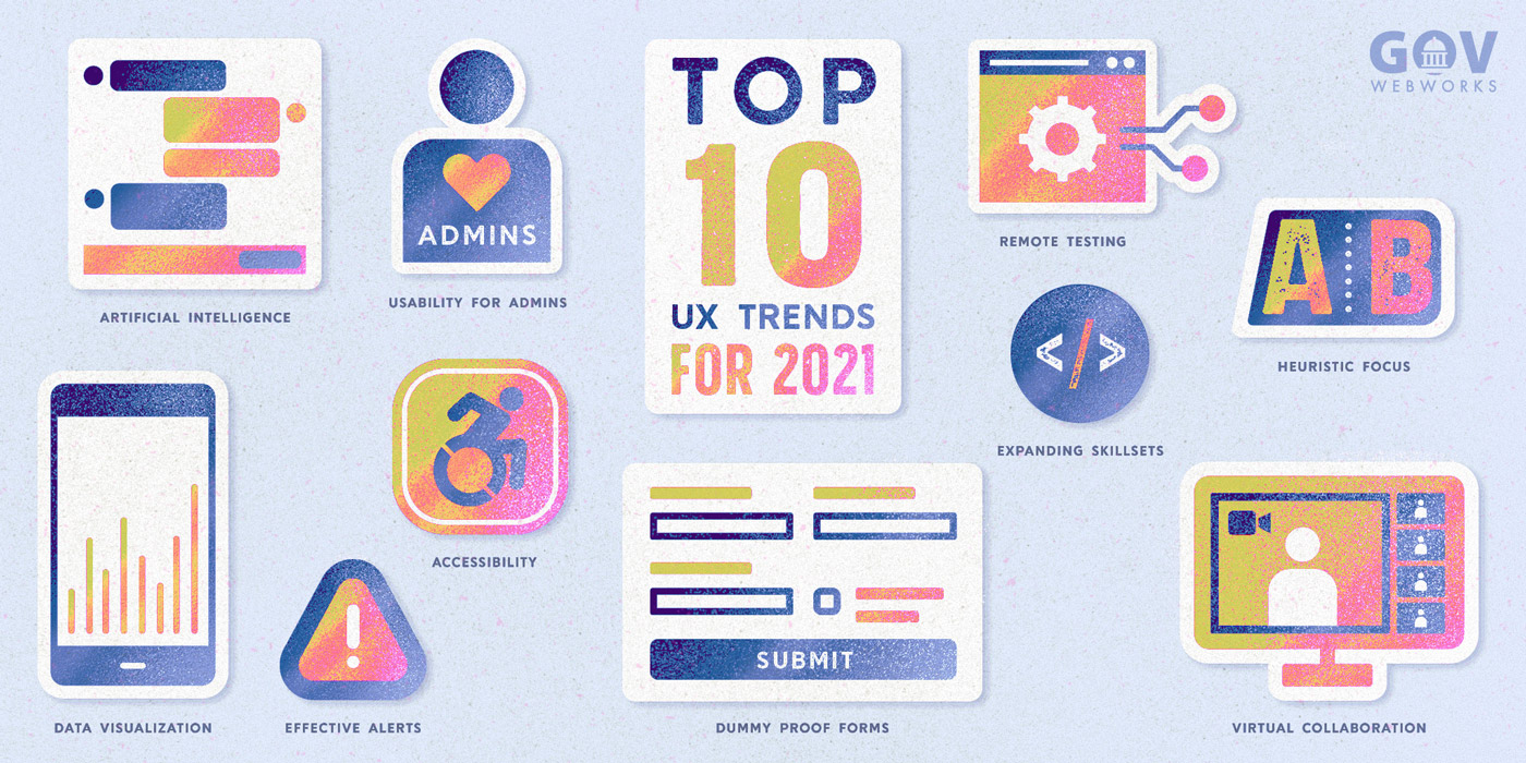
With 2020 behind us, we’ve all been working hard to make a fresh start in 2021. However, I find, as a designer, that the events of 2020 are still impacting how we interact online. Here’s a look at the top 10 user experience (UX) design takeaways from 2020, and how they’re making a difference in for citizens in 2021.
1. UX Can Be the Stress Rx
If 2020 had a tagline, it would be this: “Our stress levels are high.” The typical individual’s stress skyrocketed during the pandemic, and the role of stress on a digital application user became all the more relevant. As designers, we are in a position of power because good UX design can mitigate a user’s stress and avoid complications in their online experience by:
- Presenting a minimal set of choices on each screen
- Providing a clear and error-tolerant UI
- Honing messaging and language to avoid either over- or under-communicating
Conversely, bad UX design can seriously contribute to a user’s stress and cause heightened rates of errors and abandonment. Struggling to understand the feeling of stress and tension that can arise from a poor UI? Play around with the online game User Inyerface and just see how long you last.
There are a few things we did this year to provide positive experiences for stressed-out users. We conducted user research aimed at uncovering their needs, and put Nielsen’s 10 Heuristics for User Interface Design to use. These principles, when applied, ensure the designs adhere to basic rules and establish a user-friendly foundation. And we didn’t ignore the role of content strategy. We built trust by applying strong, thoughtful content strategy that was authentic, consistent, and supportive of the customers’ interactions with our applications.
2. Forms Should Be Easy
Oh boy, we did a lot online last year. People who’d held onto more manual processes, like registering their dog using paper forms, were forced to utilize web-based tools in response to changing and inconsistent business hours, new personal challenges, and the need to stay socially distanced from other people. We did more online or remotely in 2020 than ever before, and that brought along increased emphasis on friendly and usable online forms.
Think about your favorite little coffee shop, bakery, or corner store…did they have online ordering prior to a pandemic that has changed the way stores engage with customers? I bet they do now. Small businesses everywhere had to quickly spin up online shopping and ordering tools that they hadn’t previously used. And in America, we voted! There is also more to be done to improve the paper forms utilized by citizens. This NY Times Opinion shows how the UX of paper ballots could be improved to reduce voter error and increase the validity of votes.
To address this need, we honed our expertise in form design and challenged ourselves to make dummy-proof forms that any user, of any ability, could complete. This article from the UX Collective on form best practices is a great read on the topic.
3. Alerts Need to Work
Almost every public or consumer-facing website in the world has adopted some type of prominent alert to communicate Covid-related protocols or operational adjustments.
Designing a strong site alert depends on understanding your business and use cases. It’s important to understand what goes into a basic alert and what business and user needs the alert aims to satisfy. We asked ourselves things like:
Continue reading on Portland Webworks blog>>>
Learn more
- Contact us to learn more about applying UX to your next project
- Beyond Genericized UX: How to avoid McDonaldization of UX, or oversimplification of the design process, GovWebworks
- UX Playbook Part 1: How we identify project goals and user needs with heuristics, interviews, and surveys, GovWebworks


