Like a garden, a well-designed website begins with careful planning, strong foundations, and thoughtful arrangements. While it might look beautiful and perform well on day one, as you edit and add new content, weeds can start to creep in. Maintaining your website is not a one-time endeavor, it’s an ongoing process of pruning, weeding, and nurturing.
The pages that introduce web content accessibility issues contribute to what we call ‘content creep.’ Over time, these content changes can negatively impact the overall accessibility and usability of your site. This article will walk you through best practices for tending your digital garden, especially with respect to accessibility, as your content changes and grows.
Why it matters more than you might think
“Digital accessibility is essential for creating an inclusive online experience where everyone can access information,” says David Read, Quality Assurance Engineer and accessibility enthusiast at GovWebworks. “Perfection may be difficult to achieve, but continuous improvement ensures meaningful progress toward a more equitable digital space.”
As you may know, WCAG 2.2 is the current standard for web content accessibility, and the standard that we follow for our clients’ websites. A recent update to the ADA Title II rule, set to take effect in spring of 2026, establishes a new legal benchmark that requires state and local governments to ensure their digital content meets accessibility standards at the WCAG 2.1 AA level.
There’s also a growing awareness of the need for digital experiences that work for assistive technology like screen readers, but some individuals who could use assistive technology don’t have access to it. This is why it’s important to consider how users of different abilities, with and without assistive tech, reach your content.
For a personal example, I have a tremor that impacts my fine motor control, so I appreciate tools like talk-to-text instead of typing when on my phone. One of my pain points as a user is when mobile interactions require super precise selections. I often find sites don’t offer adequate clickable regions (which is a WCAG standard!). While mine is a small impairment, different types and levels of impairment are very common.
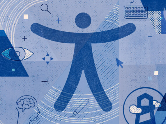
We all fall on a spectrum when it comes to our physical and cognitive abilities. And we all experience permanent, temporary, or situational impairments. Therefore, every user benefits from your ongoing commitment to accessibility on your websites.
What you can do
This blog post is for those of you with responsibility for a digital garden. The following low-hanging fruit are easily picked up to keep your garden tidy. These tips help ensure your content uses accessible practices. Most will be of particular importance for government sites, but web accessibility should be a priority for all website owners.
- Avoid text in images
- Adhere to target reading level
- Order h-tags correctly
- Use negative space
- Construct useful hyperlinks
- Include metadata on media
- Reduce use of PDFs
#1. Avoid text in images
The first thing to keep in mind for accessible content is avoiding the use of imagery with marketing or graphic text embedded in it. You can increase conformance with WCAG with alt text that replicates the text in the image. Assistive technology reads alt text to help a site visitor understand what the imagery represents. Alt text is crucial whether imagery includes embedded text or not, but writing strong alt text is an art.
Alt text can still fall short when making images accessible for the following reasons:
- It is hard to make sure the text in the image won’t be cropped at various screen sizes and image resizing is not responsive the same way HTML text is. Typically the image is simply reduced in size to fit the smaller screen, so on mobile, embedded text in the resized image may be too small to be legible.
- There is no way to ensure the text in the image meets the minimum size and color contrast requirements, the way there is for HTML-based page content.
- Embedded text content also is not typically translated by tools built into the website or by browser-based translation services.
- WCAG requires that the user have the ability to increase text size in order to retain readability. Text embedded in an image does not resize like HTML text does.
Thankfully, systems are getting better at providing feedback on the efficacy and relevance of alt text on imagery. GWW is exploring tools that can be built into our website implementations to aid alt text writing in real time.
Image Caption: In this screenshot the website has been translated by the browser, but the English language text still appears because it is built into the imagery. A user reliant on translation to consume this content cannot access the image-based text that hasn’t been translated.
Resources:
#2. Adhere to target reading level
Within your organization, it’s important that all content owners know the target reading level for your site’s content. Most government agencies target an 8th grade reading level for pages aimed at the general public, but there may be exceptions. Your site may have pages with a different target reading level if one of your audiences is known to have a higher education. A judicial branch website would have some pages that include legal jargon, for legal professionals, as well as pages aimed at the general public that should be written with simplified language. (I targeted a 12th grade reading level for this article, for what it’s worth.)
Content workflows and governance processes can help ensure your content adheres to appropriate reading levels. If your organization relies on subject matter experts, who lean more technical when writing content, have someone else review content before it gets published. If your web content is written by many people across your organization, adding a tool like Editoria11y or Hemingway may be a game-changer, as they provide real-time editorial support.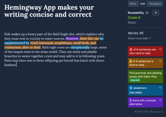
Image Caption: Hemingway is a free web-based tool that is more manual in nature. It assesses the readability of text and identifies opportunities to simplify language and sentence construction. Tools like this sometimes use large language models (LLMs) to provide the feedback.
Resources:
#3. Order h-tags correctly
Numbered h-tags (<h1> – <h6>) provide both visual organization and semantic markup. H-tags enable assistive technology to recognize the content’s hierarchy, but they are commonly misused. Here are some things to keep in mind with respect to h-tags:
- Don’t use h-tag assignment for emphasis: Let’s say you have a page that has one really important message that you want to make sure is prominent. Applying an h2 or h3 style to it achieves that prominence, but it is non-sensical in terms of the meaning that the h-tags carry to convey content hierarchy. You’ve essentially designated that text a title or a label when it is not.
- Don’t skip h-tags in sequence: Sometimes an author’s creative preferences come into play, and they may dislike the size or style of one of the nested h-styles provided, so they select one they prefer visually. This is a bad practice because the styles need to be used in sequence for the logic of their relationship to hold up.
- Don’t use h-tags for long text: Subheads on the page that are marked/styled with an h-tag should not be full sentences or long, descriptive phrases. Even if the semantic markup is assigned in the proper order, the subhead itself should be a brief and succinct label, not a lengthy string.
Correct use of h-tags is often difficult for accessibility checkers to judge accurately. Without the context of the page’s message and composition, accessibility checkers generally cannot determine whether a subhead has the appropriate h-tag. Depending on the message, it may be appropriate for that content to be a parent, a child, or a sibling of the preceding text. Most checkers are able to detect a skipped tag, but it’s important not to rely solely on an automated scan to flag all improper use of h-tags.
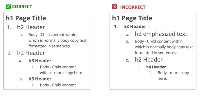
Image Caption: Let’s check out a side-by-side comparison. The ‘correct’ example on the left reflects several practices that are important:
- The content that is a direct child to the page title is marked with an h2 rather than with an h3 or other style, which would have caused the h2 to be skipped.
- No message or copy in this example uses a h-style for emphasis.
- It reflects proper nesting of h3 headers within the h2 section.
Compare that with the ‘incorrect’ example on the right. Can you see what it includes that reflects improper use of h-tags?
#4. Use negative space
Whyisthissentencehardtoread? …while this is so much easier?
Two words: negative space. The space between the words in a sentence provides the easy grouping of letters to form the words. Empty space helps the user register groupings. Adding space between paragraphs and leaving unused room on your page allows your content to be more easily digested.
Our public sector clients commonly have significant communication needs, including information-dense sites and the need for hardworking webpages. We see a preference, typically, for tight and compact layouts and the desire to minimize unused or white space, but unused space can be just as important to legibility and usability as the used space.
Content managers are urged to resist the temptation to use every square inch of their page and to remember the importance of unused space:
- It contributes to the grouping of like things for visual clarity.
- It reduces cognitive load and the sheer amount of stuff you’re asking the user to consume in any one view.
- It provides breathing room and fights the feeling of claustrophobia sometimes associated with busy pages.
If you copy and paste text from another source when building your page, you may find it carries markup that impedes the presentation or alignment of your content, so pay close attention to how it is formatted within your site.
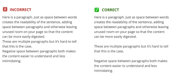
Caption: The above side-by-side example depicts the same text broken into paragraphs. The only difference is that in the ‘correct’ version on the right, there is a line break between paragraphs. This greatly improves the visual organization of the text, creating a more inviting experience for your user. It also reduces the cognitive load required to understand the information.
#5. Construct useful hyperlinks
‘Learn more’ and ‘Read more’ are two common link labels used on web pages. Less often, but still problematic, we see the URL exposed on the page, like ‘Visit https://www.govwebworks.com/2025/03/25/tending-your-digital-garden/.’ Neither is a good practice.
Screen reader technology lacks the context required for the site visitor to actually know where a ‘Learn more’ link will lead. A lengthy URL does not help someone, especially one using audio support with a screen reader, to understand and decide whether to visit that link.
One solution is that the website developer can attribute a descriptive label on the back end of repetitive text like ‘Learn more’ that is built into the component. This would enable screen reading technology to read, for example, ‘Learn more about <card title>’. This solution requires custom set-up, though, so typical content creation shouldn’t rely on it.
A screen reader commonly allows the user to consume a list of URLs on a page as a way to get an overview of the page content. Therefore, the link text should be meaningful but succinct, such as “Read more about [topic here]” otherwise the overview of the page produced by the screen reader will add no value.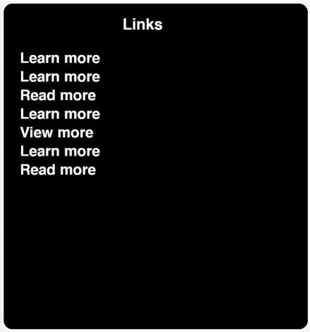
Image Caption: This is the overview provided by the VoiceOver screenreader which shows “Learn more” and “Read more” repeated throughout the page. If you were reliant on this information to decide where to navigate, these non-descriptive links are not very helpful.
#6. Include metadata on media
Let’s not forget videos and other forms of media. Recent surveys indicate that about half of Americans use subtitles when watching video-based content, including 63% of adults under 30! When creating videos or audio content, we suggest that you use settings that enable both transcription and captioning, as these features serve different accessibility needs.
Captions display spoken dialogue and relevant sounds in real-time on the video, making it accessible to Deaf and Hard-of-Hearing users. Transcripts provide a text version of the media’s audio, including descriptions of non-verbal elements. The transcripts should be provided in a structured, easy-to-navigate format and be available near the video.
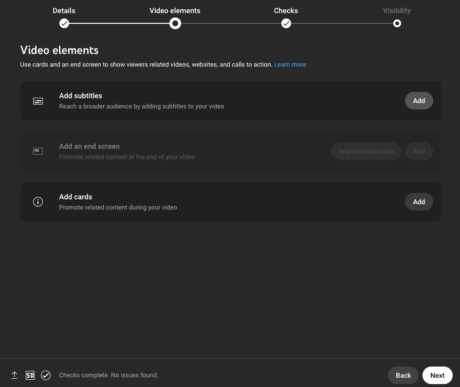
Image Caption: The above screenshot shows the settings in YouTube Studio that allow you to specify the inclusion of subtitles in a video.
#7. Reduce use of PDFs
Last but not least, PDFs are one of the biggest accessibility weeds on a website because they are difficult for screen readers to access. As mentioned above, a recent update to the ADA Title II rule will require state and local governments to comply with WCAG 2.1 AA standards by the spring of 2026. This means PDF documents will be required to adhere to accessibility standards, which means public sector organizations will want to move away from the use of PDFs for conveying critical information.
The accessibility standard for documents is PDF/UA (PDF Universal Accessibility). We are advising that ‘If it doesn’t absolutely need to be a PDF, it shouldn’t be one.’ That constitutes a logistical challenge and cultural shift for many organizations. It is crucial that information not only be accessible through a PDF. If you feel the content needs to be formatted and shared in a PDF because of the expectation that someone will download and print it, the information within the PDF should also be available on the site in HTML. The downside of this, of course, is that it involves managing the same information in both formats, which brings us back to our question. ‘Does it really need to be a PDF?’ Print-friendly settings on webpages can help ensure that HTML content can be reliably and neatly presented for print-specific needs.
If a PDF is necessary, PDF content can be remediated to meet the accessibility requirements by appending files to include metadata that enables content to be consumed by assistive technology, but remediation of PDFs is costly and laborious. Each PDF added to your site increases the risk and the expense associated with maintaining PDFs.
There will be exceptions and exemptions to the impending 2026 rules. Content that is historical in nature, and is not required for a citizen to reach, access, or understand government services, will not generally need to be converted or remediated. An example is meeting minutes from a board meeting that took place years ago. This content must be in a section of a website labeled “Archived” or similar to qualify for this exemption. However, any content created after April 24, 2026 will not qualify for any exemption and will need to conform to WCAG 2.x level AA.
To improve your site’s accessibility with respect to files, we advise a tiered strategy for addressing PDF content:
- Remove any PDF-based content that is no longer serving users and that increases the noise and clutter within your site.
- Convert content that is currently PDF to HTML where possible.
- Evaluate remaining PDFs to identify any that meet the exemption qualifications.
- Remediate remaining PDFs.
- Adopt going-forward policies that restrict the creation or addition of new PDFs in your site to limited personnel and scenarios, and ensure PDFs are remediated as they are created.
Resources:
- ADA fact sheet on impending rule
- Harvard’s guidance on building accessible docs
- Web AIM guidance on converting PDFs
In summary
While your website might have a near-perfect accessibility rating at launch, content that is added or edited over the life of the site can fail to meet accessibility standards or best practices. This gradually diminishes the site’s overall level of accessibility. These practices for managing content can help keep accessibility performance high, ultimately expanding your reach for all citizens.
By consistently tending your digital garden—pulling out accessibility weeds, nurturing inclusive content, and ensuring every new addition meets the right standards—you can create a space where all visitors can navigate and engage with ease. A well-maintained digital garden doesn’t just survive—it flourishes, welcoming everyone who steps inside.
Learn more
Want to learn more? Contact GovWebworks to schedule a free consultation on how to improve your web content accessibility.
- Accessibility-First Mindset: Interview with Lainey Feingold on how agencies can build a culture of accessibility
- Accessibility-First Mindset Tips, by Lainey Feingold
- Everyday Accessibility Tips: How teams can work together to avoid the most common web accessibility errors, and more, by David Read
- How to Fix the Six Most Frequent Web Accessibility Errors, by David Read