If “the power of the Web is in its universality,” as World Wide Web founder Tim Berners Lee said, then “access by everyone regardless of disability is an essential aspect.” Considering that 24.8% of US citizens have a disability, and up to 42% in the age range of 65 or older, it would follow that the websites, tools, and technologies we build must be designed and developed so that people of all abilities can use them. The problem for many agencies is in figuring out how to achieve this daunting and ever-evolving goal.
Web accessibility can seem daunting and expensive
The laws and standards that govern web accessibility such as Section 508 of the Rehabilitation Act of 1973 and the Web Content Accessibility Guidelines (WCAG) can be confusing and hard to navigate. Web accessibility can also seem very technical to the uninitiated, since much of it is dependent on HTML, CSS, and Javascript. Furthermore, accessibility isn’t a one-time checkbox item, it’s an ongoing process/mindset, especially for state and local government entities with the DoJ gearing up their rule making related to accessibility and their Dear Colleague Letter on Online Accessibility for Post Secondary Institutions published this spring.
Remediation, or fixing accessibility issues at the end of a project or once a website is live can be very costly, especially when custom work will need to be redone. Furthermore, when legal issues arise related to accessibility, it can be an expensive endeavor, especially if you are unable to take a Structured Negotiation approach to resolve the dispute. And of course, the costs of not having an accessible website can add up in terms of lost revenue or unengaged users when people give up on trying to access your inaccessible site.
Here’s the good news
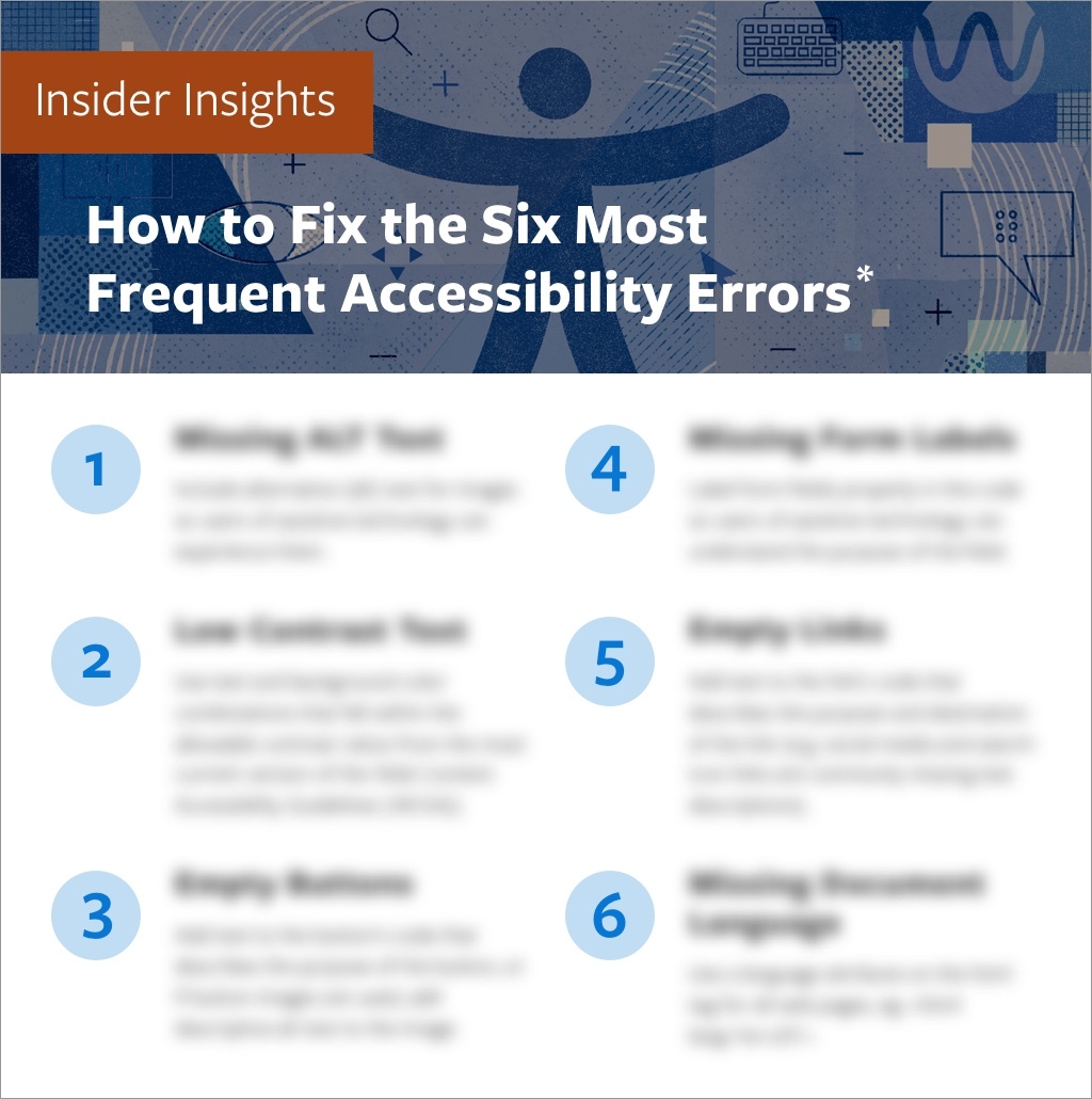
The good news is web accessibility need not be daunting or expensive. Achieving basic web accessibility actually boils down to a few simple issues. Six, to be exact. According to this year’s always informative WebAIM 1 Million, the six most frequent accessibility errors found by automated testing done on the top one million website’s homepages were:
-
- Low contrast text: Using color combinations within the content that fall outside the WCAG’s allowable contrast ratios is a major problem for individuals who are color blind or have low-vision.
- Missing alt (alternative) text for images: Not including alternative text for images can result in a confusing and negative experience for users of assistive technology.
- Empty links: If a link contains no text, the function or purpose of the link will not be presented to the user. This can introduce confusion for keyboard and screen reader users.
- Missing form input labels: When form fields are not labeled properly in the code, it is difficult for users of assistive technology to understand the purpose of the field.
- Empty buttons: If a button contains no text, the function or purpose of the button will not be presented to keyboard and screen reader users.
- Missing document language: If document language is empty, assistive technology will not know in what language to read the document.
According to the study, “96.1% of all errors detected in the study fell into these six categories.”
Shift left and take small bites
It’s not difficult to head off these errors before they make it onto your website. When you shift your thinking about accessibility earlier in the process, or “shift left”, you will be able to recognize potential accessibility issues before they become baked into your technology and more costly to fix. Remember, you don’t have to fix it all at once. Just start with one small and easy thing for you and your team. These early and small adjustments will build over time, and soon accessibility will become embedded into your culture.
There are numerous tools and techniques that you and your team can utilize to avoid the most common accessibility errors and make your product or website more functional for all users. The majority of the tools described here are automated. Though automated testing will only identify 30-60% of accessibility errors, depending on who you ask, they identify the majority of the most common errors.
Below are some simple steps each part of an organization can take to make accessibility an easy part of everyday life for your team and make sure the most common accessibility issues are resolved as part of the normal workflow.
A. All Team Members
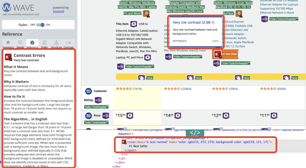
The easiest and most impactful thing anyone can do is install the WAVE browser extension from WebAIM and establish a baseline in your organization around accessibility. At the push of a button, WAVE flags and provides an easy-to-understand solution for the six most common accessibility errors, and many others.
B. Project Management (PM) and Stakeholders
If you are a project manager or stakeholder working with an external vendor, leaving accessibility testing until late or the end of the project can lead to the following issues:
- Project delays
- Increased project costs
- Accessibility work remaining undone, i.e. a project that doesn’t conform to web accessibility standards
The two most important things PMs and Stakeholders can do to avoid these issues and the common accessibility errors are:
- Include accessibility language in your RFPs and contracts, as well as the accessibility standard that the project that will be measured against, WCAG 2.1 Level AA, or WCAG 2.2, expected to be released in Q3 (July-September) of 2023.
- Establish prior to project kick-off that design and testing for accessibility will be done at all phases of the project. In other words, design for accessibility at the onset, and test “early and often.”
C. Creative
Creative teams (Information Architects, User Experience and Graphic Designers) play a huge role in the look, feel, functionality, and ultimately the accessibility of a web project.
Here are three great places to start and tools to use to help avoid the most common accessibility errors:
- Annotate designs for accessibility
Use the Five Most Common Accessibility Annotations from Deque. - Use design tool accessibility plugins
Plugins like Spark that check for accessibility in designs can be used with design tools like Sketch, Figma or XD. Deque also offers a free beta accessibility plugin for Figma. - Check contrast and color
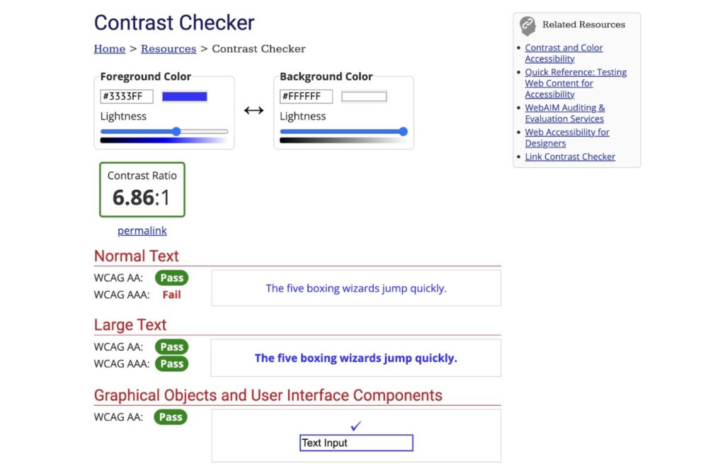
WebAIM’s easy-to-use color Contrast Checker makes sure the contrast of colors you are thinking about using in your project meet requirements.
D. Development
Working in native HTML whenever possible, with its built-in accessibility, is the most important accessibility choice that your development team can make. For example, if you use the button <button> element correctly, it automatically employs the necessary accessibility functionality.
To make sure the resulting code is accessible, automated testing tools used to find the most common accessibility errors in the Webaim 1 million study can be embedded into the Individual Development Environments (IDEs) that developers use to write code, and in the continuous integration and deployment (CI/CD) pipelines where code is approved and promoted.
The following tools are recommended to catch accessibility errors in realtime and suggest improvements:
1. Tools for IDEs:
- Tools for the CI/CD pipeline:
- Axe plugins from the GitHub page (Axe-core by Deque is the defacto standard open source accessibility engine powering the majority of automated accessibility testing tools).
- Check out an overview of using Pa11y and Cypress for performing accessibility tests.
E. Quality Assurance (QA)
Don’t wait until the end of a milestone, or worse, the end of a project, to test for accessibility. Every component should be tested as it is built. Like the rest of the project teams, the QA team can make use of automated testing tools to identify the most common accessibility errors before they make it on to a website.
Here are three of the most popular free tools:
- WAVE browser plugin by WebAim
- AXE DevTools browser plugin by Deque
- Lighthouse by Chrome
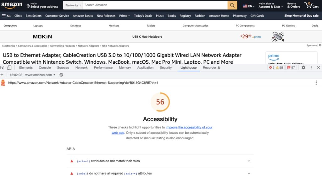
The use of automated testing tools throughout the software development life cycle frees up QA teams to focus on manual testing for the 40-70% of accessibility issues that automated testing can’t uncover.
Manual testing falls under under two major categories:
- Keyboard testing
- Screenreader testing
Check out this great manual accessibility testing overview from Harvard University for some easy ways to bring manual testing into the workflows of all team members.
F. Marketing
Last but not least, as social media has become the most important outreach tool for most of our organizations, it is imperative that we make social media content as accessible as possible.
Two of the most important things that promote social media accessibility are:
- Alt text for images
- Instructions for entering alt text for all social media platforms.
- Camelcase for hashtags
- Use #CamelCaseHashtags to make your hashtags more accessible for all users.
- Hashtags written in all uppercase or lowercase are difficult to read for all users and are particularly difficult for users with dyslexia, low vision, and users of screen readers because the screenreader will try to read the hashtag as one word if there is no differentiation between words.
Remember that the message you send with social media sets a tone about our whole agency, and that promoting accessibility sends a message that you are an inclusive organization.
Conclusion
As discussed, accessibility requirements can feel overwhelming and expensive, but not if you “shift left” and get started today in avoiding the most common web accessibility errors and make your site more accessible for all users.
It’s easy to start today with these three steps:
- Install the WAVE plugin.
- Share the above techniques, tools, and resources with your team.
- Reach out to GWW about an accessibility audit on your current site or to talk about your next web development project.
We hope this helps get you on your way to everyday accessibility.
Get tips
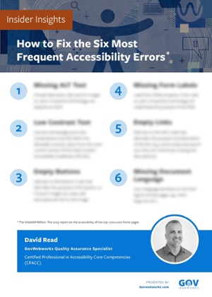
Click the graphic below to get David Read’s tips for how to fix the most common accessibility errors.
Learn more
For a deeper dive into the topic, check out the following resources:
- Consult the WCAG Compliance Checklist from The A11y Project
- Read Giving a Damn About Accessibility: A candid and practical handbook for designers by Sheri Byrne-Haberfor
- Review Accessible Fonts: Use simple, familiar, and easily-parsed fonts
- Use the Hemingway Editor to check the grade level of your content: Federal and state governmental content should be no higher than an 8th grade level
- Be VERY wary of web accessibility overlay vendors: These vendors often erroneously claim they can make your site WCAG or 508 compliant with one line of code
- Watch free recordings of recent accessibility conference sessions:
