The Challenge
United Ways of Maine administers the state’s 2-1-1 phone assistance, website, and interactive, online service directory for citizens seeking information about assistance programs and services available in their communities.
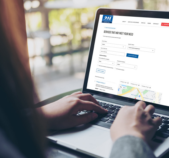
United Way and 211 Maine sought to update the user experience and visual design associated with their interactive online service directory. They felt the existing service directory tool from iCarol was difficult to use and lacked efficacy in connecting citizens with the services they needed. The overwhelming and confusing search interface, coupled with jumbled search results and incomplete listings left many users turning instead to the 211 call center to find help. Concern was expressed that the system was counterproductive to its intended purpose if it failed to match users to appropriate resources.
Our Approach
Via funding from the Maine Community Foundation, United Way engaged GovWebworks to update the user experience and visual design associated with the service directory. To inform the directory redesign, we pursued multiple qualitative methods of user research, including:
- One-on-one interviews with providers
- Onsite observations at a local 211 call center
- A targeted focus group with stakeholders
Provider insights helped identify various aspects of the current layout where design and function lacked clarity and ease of use. Along with other best practices for usability and accessibility, this research was taken into consideration as we made recommendations for improvements to the directory experience and functionality.


The Result
In response to increased demands due to Covid-19, GovWebworks rapidly developed and deployed a fully mobile-responsive, ADA-accessible directory with improved navigation and enhanced functionality. Based on feedback from user research, the updated tool seeks to emphasize plain language, limit the use of technical jargon and clinical terminology, include graphic elements that are friendly, modern and uplifting, and ensure that correct content is easily and quickly accessible.
Key enhancements of the new site include:
- A new search experience allowing users to find/filter services through ‘guided search’ or via conventional keyword search.
- Simplified language in “I Need” statements, and a separate and more prominent “Need Help” handle to make the tool easier to use.
- Geolocation enabled for “near me” searches, as well as improved location functionality.
- ‘Deep linking’ from the service category pages directly to directory results.
The rebranding efforts and revised user experience also helped reinvigorate interest from providers to be more involved with the service database.


